21 “Not so boring” milk packaging design
I wake up this morning and do my usual routine. Brush my teeth, take a shower, make the bed (apparantly my wife thinks that it’s one of my gifted talents), eat breakfast and drink milk. I’ve always drunk milk since as far as I can remember. I like it and “It does a body good!”. If you remember that ad slogan, then you and I are in the same age group.
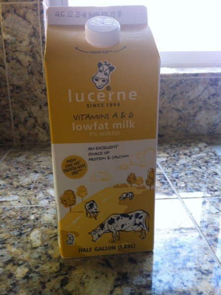
As I drink and look at the familiar yet boring looking milk carton (check out the first photo below), I cannot help thinking if the product designers at dairy companies ever thought about updating the design? I’ve been looking at this same yellow carton for years now. Or do they even care about making it interesting, appealing and engaging. Maybe not? After all these cartons only live in supermarket for days and in consumer’s fridge for a couple of weeks. Then off they go to the recycling center. Most of us are probably still half asleep when drinking milk in the morning. It doesn’t matter how the carton looks like since we don’t really look at it.
But I did. I did look at this morning and it’s boring. The yellow milk carton has a smiling cow picture and “An excellent source of protein & calcium” claim on the front with Nutrition Facts on the side (standard packaging rules). Nothing to be excited about. That’s probably why I resort to coffee to get me excited in the morning.
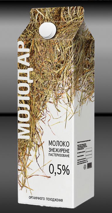
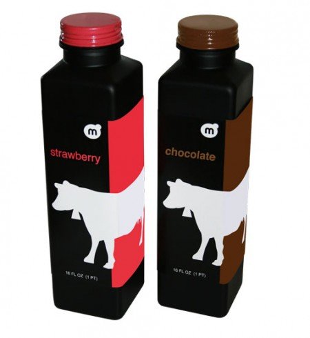
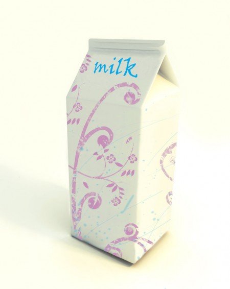
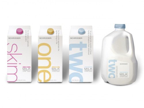
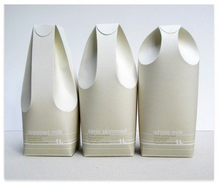
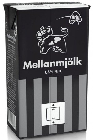
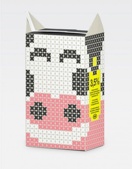
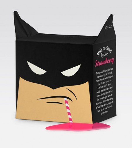
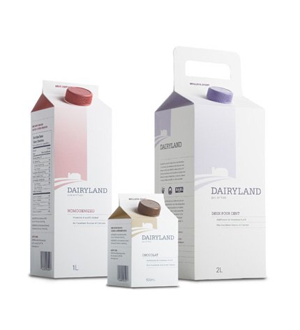
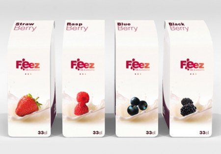
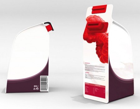
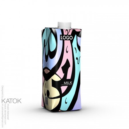
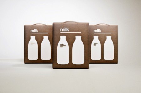
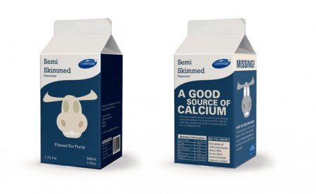
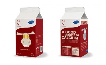
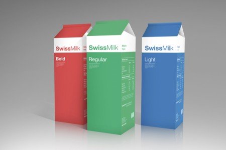
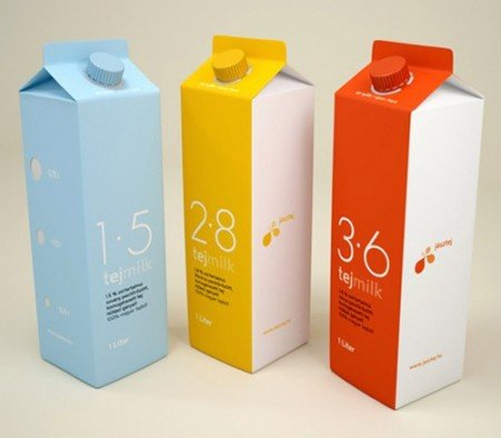
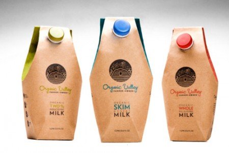
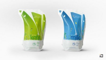
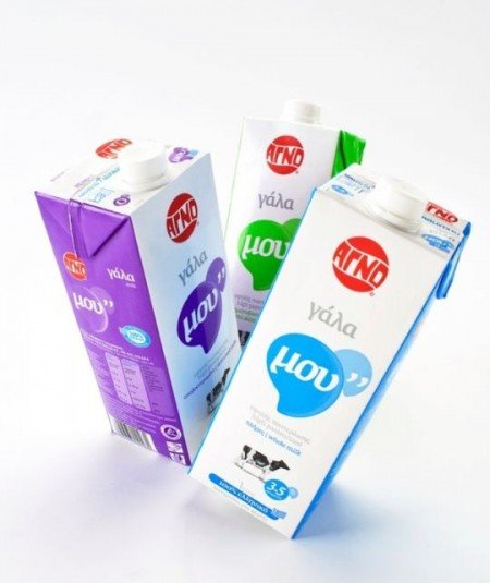
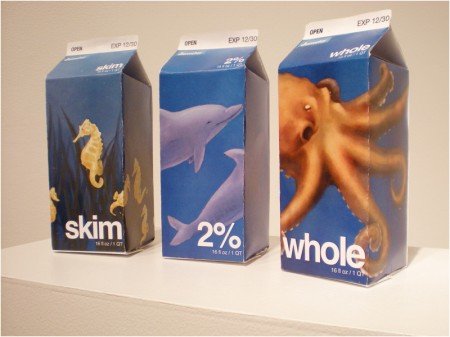
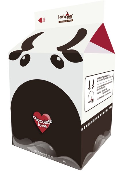
I decided to do a quick google search to see if the product design teams really don’t care about making milk carton interesting. Guess what? It looks to me they do but their design is limited to production cost and I can see that. For sale at a mere $1.09 per carton with about three weeks product live span, you don’t want to invest too much money to produce it. A few, however, decided to make milk cartons a little more interesting. There are a lot more, but you can see some of them below.





 SmashingWall.com is the ultimate online design and development community-based blog news that focuses on sharing high quality tutorials, freebies, inspirations, products design, icon design, photography and resources to designers, bloggers, entrepreneurs, new business owners and geeks in general.