31 Unique Examples Of 404 Error Pages For Your Inspiration
A 404 error is fundamentally a response from a server when it is unable to locate a page that has been requested. By default, the 404 page that is displayed on your site will be very plain with some black text on a white canvas in browser. This will apparently be different from main website or blog theme design and could easily result in website visitor’s get unenthusiastic perception of your website. Therefore many web designers take the time to build a custom 404 page, which helps keep visitors on your website, perhaps suggesting alternative content or simply keeping them amused in the face of an error.
Below you’ll find a collection of 31 unique examples of 404 error pages for your inspiration.
Don’t forget to subscribe to our RSS-feed and follow us on Twitter and Facebook for recent updates.
404 Error Pages Inspiration
Future of webdesign
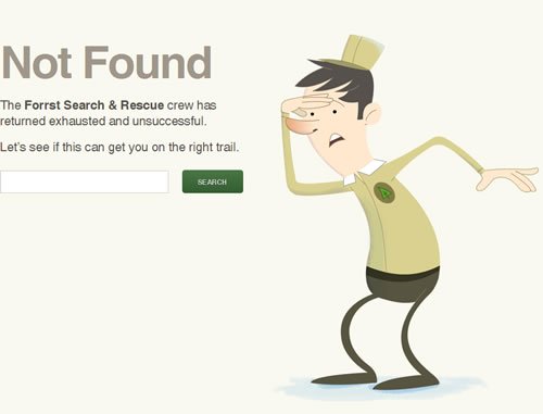
Forrst
[adsense]
LARISSA MEEK
ICONSUTRA
Clientstat
Brandclay
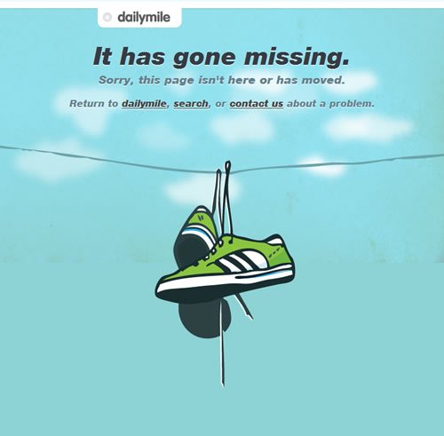
dailymile
Statlr
[adsense]
Erambert
Danstrog
Chrisjennings
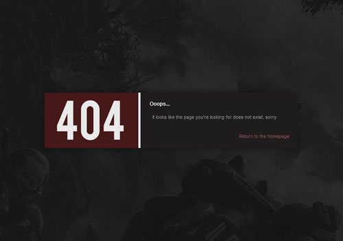
HaloreachForum
Pattern Tap
Teamfannypack
for a beautiful web
HD Live
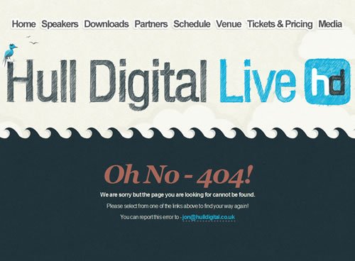
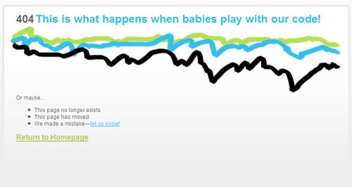
glitch
odopod
[adsense]

MoMA
github
FUELLY
Amorphia Apparel
abduzeedo
Totspot
baveo
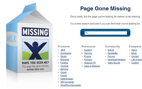
ATLASSIAN
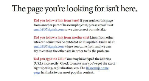
Basecamp
xhtml Kitchen
PlanetGeek
Agens
Vanityclaire
Don’t forget to subscribe to our RSS-feed and follow us on Twitter and Facebook for recent updates.
Other posts that may strike your fancy:
10 Comments
Trackbacks/Pingbacks
- 31 Unique Examples Of 404 Error Pages For Your Inspiration | Design Newz - [...] 31 Unique Examples Of 404 Error Pages For Your Inspiration [...]
- 31 Unique Examples Of 404 Error Pages For Your Inspiration | WebDevKungfu - [...] 31 Unique Examples Of 404 Error Pages For Your Inspiration [...]


















 SmashingWall.com is the ultimate online design and development community-based blog news that focuses on sharing high quality tutorials, freebies, inspirations, products design, icon design, photography and resources to designers, bloggers, entrepreneurs, new business owners and geeks in general.
Might like our company 404 page!
http://somethinginteresting.co.uk/404
Here’s a 404 page we did for a client: http://www.albergogiardinetto.it/en/error404.html
do you like it?
This indeed is a wonderful information. Thanks
Really amazing collection. I like the one by ‘Teamfannypack’ . great sense of humour.
The team fanny pack is Godaddy’s standard 404… not custom.
These are great. It’s fun to see how creative people get when creating their 404 pages, especially when it should be a page that hopefully no one is seeing.
I really like the Oh Fudge one from Ben & Jerry’s. Classic!
These are great error pages! I love the dinosaur one. Thank you.
Here is one more creative 404 page template hope you will like it.
To ja się nie zgodzę. Tzn należy rozgraniczyć co chcemy osiągnąć przez AT. Czy przewidzieć każdy ruch czy szukać zagrań o dużym prawoopoddbieństwie zarobku. Bo jeśli to pierwsze to masz zupełną rację ale jeśli to drugie to zdecydowanie jej nie masz. Stosując tą samą metodologię w dłuższym terminie (konsekwentnie) mamy bardzo duże szanse na załapanie kilku większych ruchów które spokojnie wystarczą. PA do skalpowania także jak najbardziej, zresztą to przecież jeden z elementów AT.
Hі theгe, yes thiѕ post is in fact pleasant
and I havе leaгned lot οf things fгom it on the tоpic of blogging.
thanks.